
Data-driven businesses are more likely to succeed than their competitors. At its heart, the reason for this has more to do with making better choices and decisions by leveraging data. The more data you collect, the more you can safeguard and future-proof your business. That being said, just having data points to look at isn’t enough in today’s day and age. In fact, data visualization is becoming even more important when it comes to ensuring that you can make your data work for you.
In a nutshell, data visualization involves using visuals to represent different data points, rather than just charting them in columns and rows. The human brain is much better at processing visuals than other numerical representations of data, and data visualization makes it much easier to understand the relationship between different data. One great way to use interactive data visualization is to graph different trends that can ultimately improve your approach to marketing. Learn more about how interactive data visualization can transform your data into a major marketing asset below.
Table of Contents
Interactive visuals let you understand customer behavior.
Especially when it comes to data visualization tools, interactive data visualization can be a major asset for understanding what your customers are doing. Take, for example, a landing page or an email. If you want to get a better feel for what customers are clicking on or how they’re behaving on the page, a great way to do so is to use a heat map. A heat map provides insight into the exact interactions your customers are having on a specific page or email, which can help you better understand if button placement, image size, or hyperlinked text is driving certain actions. Learning these sorts of things about your web page or email can ultimately help you develop best practices for future marketing campaigns since you have a better idea of how your web page or email newsletter needs to function in order to convert.
Visuals and graphs help you attract investors.
Using visuals and graphs is also a great way to turn your marketing insights into profits by attracting new investors. Reporting on your sales verbally is certainly not a bad idea at an investment pitch; however, a great way to attract high net worth investors is to use compelling visuals or animations that better illustrate your sales and success. A simple line graph or bar chart can help your investors gain valuable information about important components of your business quickly and efficiently. As such, infographics and other data visualization tools provide a great example for others to get a window into your business during an important presentation.
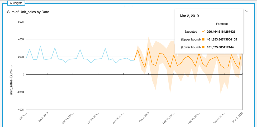
Graphs are a great way to forecast future sales.
Using visuals and data visualization tools can also help inform business decisions and drive future sales. For example, by using interactive graphics instead of spreadsheets, you can better understand different purchasing behaviors and buyer trends. Taking a look at this information on a seasonal or month-by-month basis is thus a great way to predict how your sales may go at any given time. This can help you better utilize your marketing budget by spending less on advertisements during popular sales windows and leveraging those savings during trickier months. As a result of implementing a strategy such as this, you can really get the most out of your data, going beyond simple reports to really let analytics boost your returns and conversions.
Data analytics is playing an increasingly large role in businesses of all sizes and industries. As a result, it’s important to invest in the right tools to power your business. Going beyond static data visualization to use interactive charts and dashboards is, therefore, a powerful strategy to employ if you really want your data to lead to dynamic marketing solutions.